Effective Skeleton Screens
When I first stumbled on the idea of skeleton screens, thanks to Luke Wroblewski talking about them back in 2013, I latched onto them pretty quickly. I have never been a fan of progress bars and spinners, and skeleton screens seemed like a smart step in the right direction.
For those unfamiliar, a skeleton screen is a method of displaying the outline (skeleton) of the content to come, typically using gray boxes and lines instead of a progress bar while content is loading. It’s a pretty creative approach to handling wait—undoubtedly more creative and helpful than a perpetually spinning circle.
But even good ideas can become bad ones if we stray too much from the original intent.
The other day on Twitter, Jeremy Wagner lamented the use of skeleton screens:
Am I the only person who thinks skeleton UIs are incredibly bad UX? “Here comes some client-rendered content—oops, wait you get rectangles for now!”
It got me thinking about how we’ve taken a carefully applied optimization and started applying it haphazardly without giving too much thought as to why and how to use it effectively.
It’s helpful to revisit Luke’s application of the approach.
At the time, Luke was working on a startup called Polar. Polar was a mobile application that was built around the idea of micro-interactions. Users were presented with a simple “either-or” poll. They’d tap on an answer and then move on to the next poll.
At several locations in the application, such as when new polls were loaded, it would take some time for those elements to download and be displayed. Polar used, at first, the same thing many applications use: a generic spinner.
When they looked at user feedback, they saw people frequently complained about the amount of time they spent waiting for the content to refresh. Given the constraints the app faced with the network and web view performance at the time, they were a bit limited on what they could do from a technical perspective. Instead, they adjusted the design, switching from spinners to a skeleton screen that incrementally filled in as content arrived back from the server. People stopped complaining about wait times, and a new perceived performance “best practice” was born.
But the thing about best practices is that they’re only best practices when used in the right context. Used the wrong way, even best practices can be detrimental. That’s why when I do performance training, I always start with how the browser and network work. You need to know why something works to know when it makes sense and when it doesn’t.
So going back to skeleton screens, why do they (at least in theory) work?
It has to do with active waiting versus passive waiting. With active waiting, we’re doing something that feels like progress while we’re waiting. With passive waiting, we’re, well, passively sitting there, with nothing to do as we wait for whatever it happens to be we’re waiting for to happen. According to research on time perception, active waiting periods are perceived as faster than passive waiting phases.
With a progress bar or spinner, our entire waiting period is passive: there’s nothing for us to do but watch this spinner that has absolutely nothing to do with the content we’re about to see.
With Polar’s skeleton screen, some of that wait time gets flipped into an active state. If we look at the screenshots of how the page progressed, we see we went from a few gray boxes and primary text headings to some filled in textual content and, finally, to displayed images and icons.
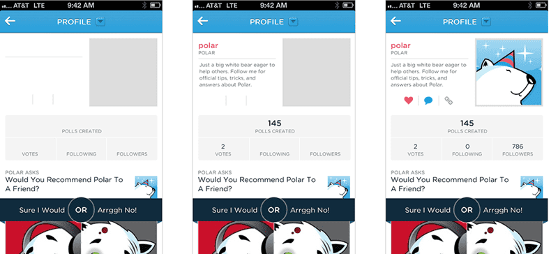
Each time that state changes, we have a brief moment of active waiting as we start to process the information presented to us, giving us context about what is eventually going to arrive.
That’s why, in theory, skeleton screens are useful. They can provide instantaneous feedback about what is to come, and, as that content arrives and gets filled in, they keep pulling us back into brief periods of active waiting, helping the time to fly by a bit more quickly.
To me, that seems sound, but there are a few things we have to keep in mind when implementing skeleton screens in our interface.
First up, it’s a workaround. If you can display content right away, by all means, do that instead.
If you notice, Jeremy’s specific example was client-side applications taking too long to load. That’s unfortunately very common. In my experience profiling sites and applications that rely on a lot of client-side JavaScript to display content, those delays are usually measured in seconds, not milliseconds.
Let’s pick on an example Scott Jehl presented: YouTube in a desktop browser. We’ll pick on it not because it’s a particularly egregious example but because it’s an excellent example of many of the common issues across skeleton screen implementations today.
In that example, as tested on a Cable connection, we’re staring at gray boxes for 6.9 seconds before we get to see the content.
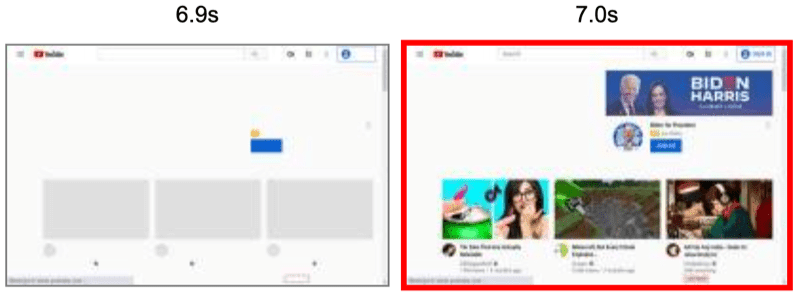
That’s far too long of a delay to expect a few gray boxes to hold us over…we’re only in that active waiting state for a moment before we’ve digested the context provided to us and are ready to move on. All that research about how time perception speeds up during an active waiting state? There’s also research that suggests that as the total wait time gets longer, the benefits of being in an active state of waiting wane a bit.
Which brings us to the next consideration—that active state isn’t going to last forever, so we need to make quick progress. If we can’t for whatever reason, then we need to make incremental progress.
Remember, in the Polar example, we saw three basic stages:
- Gray boxes, borders, and headings
- Text content
- Imagery
If the loading period is very fast, maybe that’s enough to keep us in an active state the entire time. If the loading period is a bit slower, we’re going to toggle between active and passive waiting states, and that’s where that incremental approach helps. At each stage, we’re given additional context to occupy us for a few moments.
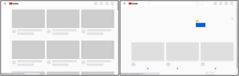
Looking back at the YouTube example, we have two basic stages (pretty typical for many skeleton UI’s we see implemented today):
- Gray boxes and borders
- All the things!
There are no initial headings to provide any additional context, and there’s no incremental stage where we have more information to process.
After the initial moment or two that it’s going to take us to process that original display of gray boxes, we’re going to switch right back into a passive waiting state for the rest of that duration. Without that incremental progress (and without the additional context provided by early headings), we’re going to be spending the majority of that time in a passive waiting state and, understandably, we’re going to be annoyed by the delay—even if it wasn’t as long as it is.
Another thing to consider: the expectations should match reality.
In the Polar app, the original boxes don’t shift around. Instead, they accurately depict the content that is coming and where it’s going to be displayed.
Once again, the YouTube page is a good example of the opposite effect.
The first screenshot below shows the initial state of the page. We have a grid of boxes where the videos are going to display, and some circles for thumbnail images. But the second screenshot shows that the entire skeleton screen shifts significantly as an ad is displayed.
In this case, we were given expectations of what content would be displayed and where, and those expectations ended up being misleading. We now have to re-orient ourselves to where the content ends up being displayed.
When the skeleton screen doesn’t match the outcome, we’ve created confusion and frustration that will overcome any benefit you might have gotten from trying to handle that delay in a better way.
Generally, I think there’s also some conditioning to be aware of here. As the pattern of skeleton screens becomes increasingly familiar, the ability it has to switch us into that active state of waiting is going to decrease. If we’re trying to use this approach as a band-aid for long loading times that users have to encounter every time they use our site, it’s going to fall on its face pretty quickly.
So are skeleton screens a bad user experience, or are they are a nice way to improve perceived performance?
Like anything, they’re likely a bit of both. If you’re weighing whether or not to add one to your site or application, keep in mind:
- Are they necessary? Can you avoid the delay altogether with a different approach?
- Skeleton screens only distract for so long before they become frustrating. If you have a long delay at a critical stage in your site or application, shortening that delay should still be a primary focus.
- When you use skeleton screens, make sure people see incremental progress and that they’re given as much context as possible at each stage in the progression.
- Make the expectations match reality. Skeleton screens that falsely represent what’s coming or how it will be positioned, will be disorienting and cause confusion.
Finally, test.
Skeleton screens worked for Polar. They knew it worked because they did the necessary research to see how it impacted people’s perception of the application as a whole. That doesn’t mean it’s going to work with your audience, or for all of your audience in the same way.
One of the healthiest and most important things we can do is continuously challenge ourselves to question why a “best practice” is labeled as such. When we understand why and how it works, we put ourselves in a much better position to know how to properly apply it in our own situations, and when it makes sense to do so.