In-Browser Performance Linting With Feature Policies
One of the absolute best things you can do to help keep performance in check is to provide a series of visible, well-placed checks and balances in your development workflow to always keep performance front-of-mind. One thing I’m very excited about in this context is feature policies.
Feature-Policy is a relatively new feature that lets you opt-in or out of certain browser features on your site.
For example, you could tell the browser not to allow the use of the Geolocation API by providing the following header:
Feature-Policy: geolocation 'none'
There are a lot of benefits from a security and performance standpoint to Feature-Policy, but what I’m excited about at the moment are the ways you can use Feature-Policy to help make easy-to-overlook performance issues more visible. It essentially provides in-browser performance linting.
Oversized-images
By default, if you provide the browser an image in a format it supports, it will display it. It even helpful scales those images so they look great, even if you’ve provided a massive file. Because of this, it’s not immediately obvious when you’ve provided an image that is larger than the site needs.
The oversized-images policy tells the browser not to allow any images that are more than some predefined factor of their container size. The recommended default threshold is 2x, but you are able to override that if you would like.
So, given the following header, the browser will not allow any origins (that’s the ‘none’ part) to display an image that is more than 2x its container size (either width or height).
Feature-Policy: oversized-images 'none';
If you wanted to be more lenient, you could tell the browser not to display any images more than 3x their container size:
Feature-Policy: oversized-images *(3) 'none';
In either case, if an image exceeds the threshold, a placeholder is displayed instead, and an error is logged to the console.

With the oversized-images policy in place, large images are still downloaded, but placeholders are shown instead, and an error is logged to the console.
Unoptimized Images
Another common image related performance problem is unoptimized images. It’s all too common to find images that may be appropriately sized, but haven’t been adequately compressed. A lot of unnecessary metadata gets added to images when they’re taken and created, and that often gets passed along. One particularly annoying example are images that have thumbnails of themselves embedded in their metadata. I’ve seen plenty of instances where the embedded thumbnail (that the designers and developers didn’t even know was there) weighed more than the image itself!
On top of that, there’s also just general compression that many formats provide to get the ideal balance of quality and file size.
Using both the unoptimized-lossy-images and unoptimized-lossless-images policies, we can tell the browser to compare the file size to the dimensions of the image.
Feature-Policy: unoptimized-lossy-images 'none';
Feature-Policy: unoptimized-lossless-images
'none';
If the byte-per-pixel ratio is too high, the browser will display a placeholder image and log an error to the console.

The unoptimized-* policies result in a placeholder image being displayed, just as with the oversized-images policy.
The recommended byte-per-pixel ratio for lossy images is 0.5 and the recommended ratio for lossless images is 1. There’s a little wiggle room here. Right now, there’s an overhead allowance of 1kb for lossy images and 10kb for lossless images.
For example, let’s say we have a 200px by 200px JPEG. JPEG is a lossy format, so the recommended byte-per-pixel ratio is .5, and the overhead allowance is only 1kb. To figure out what image size would be acceptable, we would multiply the dimensions by the accepted ratio and then add in the overhead allowance.
(200 x 200 x .5) + 1024 = 21,024 bytes or 20.5kb
If the image were a lossy format, then our allowance would be 10kb, and the accepted byte-per-pixel ratio would be 1. Other than that, the calculation would look the same.
(200 x 200 x 1) + 10,240 = 50,240 bytes or 49.1kb
That allowance is likely to change in the future. In fact, while Blink defaults to a 10kb allowance for lossless images, they’re already experimenting with an unoptimized-lossless-images-strict policy that changes that allowance to only 1kb.
Unsized Media
What’s old is new and all that.
For a long time, putting height and width attributes on your image was more or less a best practice. Without those in place, the browser has no idea how much space the image should take up until the image has actually been downloaded. This leads to layout shifting. The page will be displayed, and then the content will shift once the image has arrived, and the browser does another layout pass to make room for it.
When we started wanting images to scale fluidly with the help of CSS, we more or less recreated the issue regardless of if those attributes existed or not. As a result, a lot of folks stopped using them altogether.
But, thanks to recent work spearheaded by Jen Simmons, Firefox and Chrome can compute the aspect ratio of an image from its height and width attributes. When paired with any applied CSS, this means they can preserve space for those images during the initial layout phase.
The unsized-media policy tells the browser that all media elements should have size attributes, and if they don’t, the browser should choose a default. It’s a little more complicated than that, but the gist is that if you don’t have size attributes, the browser will use 300px by 150px.
Feature-Policy: unsized-media 'none';
With this policy in place, media will still be displayed, but if the size isn’t defined in the HTML, you’ll very quickly see as all the images will be sized at the default dimensions. And, as always, an error will be reported in the console.

With the unsized-media policy, the original image or video is still displayed, but the browser defaults to a 300px x 150px size for each image without the height and width attributes.
It's probably worth noting because it tripped me up at first, but if you're using the unsized-media policy in conjunction with the oversized-images policy, don't be surprised if you suddenly see a bunch more violations from oversized images. Because the unsized-media policy now changes your unsized images to 300px by 150px, the browser will use that size as its starting point when determining if an image is oversized.
Surfacing Less-Visible Policy Violations
What I love about the image related policies is that they take something that isn’t usually noticeable and makes it jump out at us as we’re building. We know if we’ve neglected to optimize an image or provide sizing attributes because the display of the page is impacted. In fact, reporting is their primary benefit. While unsized-media would potentially reduce layout shifting, the other policies still result in the images being downloaded, so the sole benefit is this increased visibility.
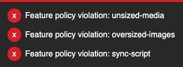
There are a few other potentially helpful policies from a performance linting perspective. Policies like sync-script (which blocks synchronous script execution), sync-xhr (which blocks synchronous AJAX requests) and document-write (which blocks any document.write calls) all come to mind.
These other policies great from a performance and control standpoint, but out of the box they’re a little less exciting from a linting perspective. Unless you have a synchronous script that is necessary for your page to display (which, ok, is not that hard to find) most of the visibility benefits these policies provide are in the form of console errors and, frankly, I suspect most developers don’t pay super close attention to those (though we all probably should).
That being said, we can make them more visible by using the ReportingObserver API to watch for violations and display them prominently on the page:
let reportingAlerts = document.createElement('ul');
  reportingAlerts.setAttribute('id','reportingAlerts');
  document.body.appendChild(reportingAlerts);

const alertBox = document.getElementById('reportingAlerts');

new ReportingObserver((reports, observer) => {
  let fragment = document.createDocumentFragment();

  Object.keys(reports).forEach(function(item) {
    let li = document.createElement('li');
    li.textContent = reports[item].body.message + ': ' + reports[item].body.featureId;
    fragment.appendChild(li);
  });

  alertBox.appendChild(fragment)
}, {types: ['feature-policy-violation'], buffered: true}).observe();
I setup a quick and dirty CodePen to show how it might look.

An example of how you could display feature policy violations on in your local development or staging environments.
The Catch
The big catch: browser support. Only Blink-based browsers (Opera, Edge, Chrome, Samsung) seem to support the header right now. (Firefox and Safari support the allow attribute intended for iFrames.) Even there, you have to enable “Experimental Web Platform features” (found in about:flags) for many of these to work.
How I’m Using Them
That’s not a huge issue for me personally. Since I like to use these policies as in-browser linting, I don’t need to try to ship any of these headers to production or have them work for everyone—they need to be there for me and anyone actively building the site. I use Chrome as my primary development browser anyway, so it’s just a matter of turning the flag on once and forgetting about it.
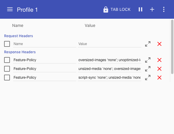
The simplest way I’ve found for doing this is through the ModHeader extension. The extension lets you define custom headers to be passed along as you’re browsing the web.

The ModHeader extension lets me set up a Feature-Policy header that I can easily toggle on and off as I browse around the web.
I have three different Feature-Policy headers that I primarily toggle between:
oversized-images 'none'; unoptimized-lossy-images 'none'; unoptimized-lossless-images 'none';unsized-media 'none'; oversized-images 'none'; unoptimized-lossy-images 'none'; unoptimized-lossless-images 'none';script-sync 'none'; unsized-media 'none'; oversized-images 'none'; unoptimized-lossy-images 'none'; unoptimized-lossless-images 'none';
I keep the first one on a lot—it’s fascinating to browse the web with these policies applied. It’s scary how massive some images are. There’s a lot of room for improvement.
There is a LOT of unsized-media out there (I’m guilty too!) so that one gets annoying if it’s on for general browsing, which is why I have it in a separate policy I can toggle on. The same thing goes for sync-script—it breaks a lot of sites.
A few teams I’ve worked with have started using a similar flow to have those policies running so that when they’re working on the local development and staging environments, they can quickly see if something is amiss. Of course, in those situations, I recommend turning on any and all performance related policies so that they’re able to catch issues right away.
I’m hopeful that we’ll see a few other browsers add support eventually—while Chrome is my primary development browser, I do bounce between browsers, and it would be helpful for this to be available across them all. This is one of those rare times, however, where experimental support is enough to make a feature like this instantly useful.
A lot of performance issues stem from them simply not being very noticeable to those of us doing the building. Changing that wherever we can is one of the best ways to make sure that all that low-hanging fruit doesn’t go overlooked.