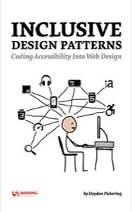
Inclusive Design Patterns
Coding Accessibility into Web Design
Finished:
Buy it from: Smashing Magazine
Accessibility is one of those topics that can be very intimidating to folks. There is a lot to know and a lot you can get wrong. Plus, since accessibility is felt so personally by many, the reaction to accessibility mistakes online tends to be…unpleasant. It makes a lot of people I’ve talked to feel stuck, not sure how to proceed.
Heydon’s book doesn’t attempt to teach you everything you need to know about accessibility. It does something more important: it teaches you how to think about building inclusivity into your application throughout the process of designing and building it.
Instead of walking you through a checklist of what to do for each of the various impairments users may have to battle, the book walks you through building different components. For example, there’s a section where it walks through marking up a blog post. Sounds simple, but there’s a lot of thought and care being applied to ensure that the post is accessible: the markup used, how screen readers will interact with the post, transcripts for videos, link labels, reading level and more. As a result, you learn to think critically what you’re building and how different people will want to use it.
I have a few minor nitpicks from some of the early performance recommendations, though to be fair the book came out in 2016 and I’m not sure how many of my critiques would’ve been applicable then. They are, also, minor. Nothing he states there is wrong, just a few things that are a bit less than ideal.
That minor nit aside, Inclusive Design Patterns is a fantastic resource for any developer—and this should be all of us—who wants to build a web that can be used by everyone.
One last parting shot, I have to note the quality of the physical book itself. I love a beautifully crafted hardcover and Smashing did a great job with this one.